
UX DESIGN CASE STUDy: Cotton Candy Store

project overview
Spinn Candy sells Cotton Candy in Bulk To Corporate Event Planners and Small Businesses.
The Problem : Needed a Professional looking site that clients would be able to purchase cotton candy in bulk.
The Goal : Design a Cotton Candy Site site users are able to purchase cotton candy in bulk at a discounted rate. My Role : UX designer designing Shopify Website from conception to delivery. Responsibilities : Rebrand, paper and digital wireframing, conducting usability studies, accounting for accessibility, and iterating on designs.

Understanding the user
I researched clientele and created empathy maps to understand the users I’m designing for and their needs. A primary user group identified through research was Corporate Event planners.
After research it revealed that there was a need for convenience and an easy ways to find things. Another insight was they were looking for reliability and being able to customize labels.
USer Research pain points

Custom Labels Need To Be able to add Our Own Logos Easily.

Reliable Need To Make sure Order arrives on Time For Event and is Fresh.

Budget Need To make sure there is enough items for all attendees and it meets our budget.


User story:
As a Corporate Event planner I want to deliver beautiful events on time and within budget so that my manager will be pleased with my work.

Goal Statement:
Our website will let users purchase cotton candy easily. Which will have a great effect on busy event planners timelines by helping them get cotton candy on time and within budget. We will measure effectiveness by increase in online sales and AOV.

StoryBoard

starting the design
PaPer wireframes:
I prioritized the pdp page as seen here to create a seamless user flow choosing a flavor and selecting the correct options.


PaPer wireframes:
Taking the time to draft iterations of solution on paper ensured that the elements that made it to digital wireframes would be well-suited to address user pain points.
the design
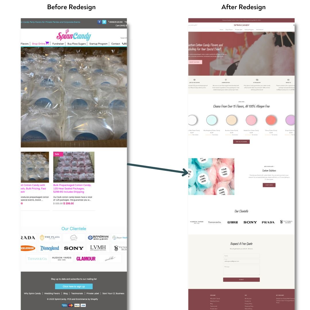
Final Design: Homepage
I wanted to create a professional looking site for the corporate event planner. I also wanted to showcase the trust and reliability using credibility. They were not interested in ingredients but that it would be fresh on arrived on time so this is what we highlighted in the icons section.
Final Design: PDP
Users wanted to be able to see quantity discounts. So I designed a chart with quantity discounts that user is able to select and an optional upload option to customize their label.

accessibility considerations
Clear Hierarchy and Navigation Structure
Making Sure High Contrast of Text on Background Colors
Buttons are bright and bold and corresponds to image.
going forward
impact
The new website is so clean and easy to navigate and caters to the corporate event planner and addresses their unique needs.
takeaways
what i learned
While redesigning Spinn Candy Website. I learned how important it was to understand the user and their needs.
Conduct a round of usability studies to validate whether the pain points users experienced have been effectively addressed.
next steps
Monitor and test new design to make sure Sales and AOV are increasing.
Thank you for your time reviewing my work on Spinn Candy’s Redesign!